
New: Custom Ln Statistics for the C50
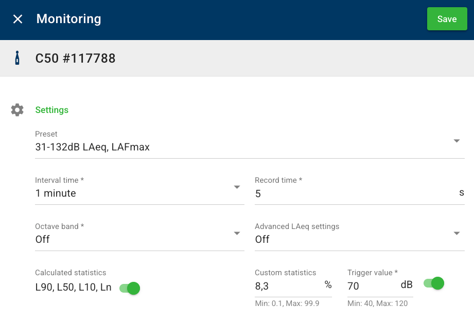
We’re excited to introduce Custom Ln Statistics for the C50 — set your own percentile noise level (Ln) to display on reports and trigger text/email alarms.
Where to find it
In Settings → Monitoring Settings on your C50.
What’s New?
Custom Ln Statistics – Define your own percentile values (e.g., L8.3, L10, L95) to better capture project-specific conditions or to meet local compliance requirements.
Custom Ln Alarms – When configured on your Message Rules, your chosen Custom Ln can now trigger text or email notifications when thresholds are reached.
Previously available
Previously, you could enable the following reporting statistics on your interval charts:
L10 – Noise level exceeded 10% of the time (represents peak or high noise events)
L50 – Level exceeded 50% of the time (median noise)
L90 – Level exceeded 90% of the time (represents background noise)
Summary
L10, L50, and L90: Reporting only
Custom Ln: Reporting + optional alarms via Message Rules
